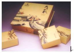
Third, the color of goods packaging to consider the interests of different ethnic regions Due to differences in cultural traditions, religious beliefs, and political backgrounds in different countries, different countries and regions have different preferences for color and usage habits. Therefore, special attention must be paid to export products. In Africa, in addition to the areas affected by Europe, they are generally very fond of bright monochromes and have strong contrasting colors. Norwegians are very fond of bright colors, especially red, blue and green, which is related to the longer local winter time. Bulgarians don't like to use bright colors, especially green; in Ireland, green is the most popular; Austrian green is also the most popular, and the use of green on clothes is considered a symbol of nobility. In France, dark green can make people think of Nazi soldiers' clothing and produce disgust. In Iraq, the olives of the national flag are commercially avoided; however, in Pakistan, the emerald green of the national flag is the most beautiful. In Sweden, blue, yellow representing the national color is not used for commercial purposes. But in Turkey, the red and white colors representing the country are more popular. In Europe and the United States, the colors tend to be harmonized, with more intermediate colors and less primary colors. The overall tone is softer and the color contrast is not very strong. In order to attract attention, brands and texts are often contrasted. Southeast Asia likes bright colors and does not like yellow or gray. In Japan, generally do not like big red and green. The pattern requirements are simple and clear. Fourth, commodity packaging must have a strong decorative color The decorative nature of color is to get rid of the shackles of natural colors and to design the ideal color in people's minds. But this kind of color is neither altogether dismissing natural colors to create in a vacuum, nor is it moving the natural colors intact to the screen, but is not bound by natural colors and is refined and subjectively imagined on the basis of natural colors. To make it more organized, more regular, and more able to express the wishes of authors and consumers. This color is also called decorative color. The decorative color focuses on the formal beauty of discovering and studying natural scenery colors, and studies the laws of contrast and harmony between various hue, lightness and purity in natural hue. Because of the restrictions imposed by the decoration requirements and craftsmanship, it is impossible to reproduce nature, and only with a few wins, the most representative color impression can be extracted from a variety of colors to express feelings. The decorative colors not only have appreciation, but also have practical, economic, aesthetic and other characteristics. Commodity packaging colors should have strong decorative properties, and the following principles should be followed: 1. The more uniform the color, the stronger its decorativeness. Harmony and reunification is the basic law of nature. Under certain circumstances, there is no inconsistency in any color of the natural world. For example, at sunrise, beautiful radiance shines on the earth in a red tone, and rainy days and rainy clouds show gray tone. These are all extremely harmonious and unified. From an aesthetic point of view, each has its own natural beauty and sentiment. Figure 4 2, the simpler the color, the more refined, the stronger the decorative. Nature's colors are extremely complex, and most of them are grey tones, and the high purity of colors such as the green seedlings, the fiery sunset and the blue sky are extremely rare. In the complex natural colors, the three primary colors of red, yellow and blue are refined to the end, followed by the three colors of orange, green and purple. The colorless series of black, white, and gray from which color is removed from color, and another rich color such as gold and silver are all basic and simple color systems, but they are highly refined products. Therefore, we often use three primary colors, or three colors, or black, white, gray, or gold, silver, to decorate the works, so as to obtain a strong decorative effect. Figure 5 3, the more limited the color, the stronger its decorative. Because the color is limited, although it is not free to use, plus there are constraints such as process production and cost materials, which requires us to jump out of some of the thinking style, try to explore less color and symbolic stronger colors. Figure 6 4, the more flat the color, its more decorative. Such as Chinese painting, the exclusion of light interference, the pursuit of flat light effect, commonly used single-line painting method, it has a strong decorative. Figure 7, 8 School of Art, Central South University, Wu Shibai. Source: China Packaging 2005/4 Crochet Bags,Crochet Market Bag,Crochet Bag Pattern,Handmade Crochet Bags Shandong Guyi Crafts Co.,Ltd , https://www.guyicraftscn.com